Fixing the navigation of the #1 crowdfunding platform, GoFundMe
Around the world, people rely on GoFundMe to raise critical funds, yet they were overwhelmingly confused how to use its website navigation. I led a cross-functional redesign, conducted research, and managed an international rollout that drives millions in annual product-led growth each year.
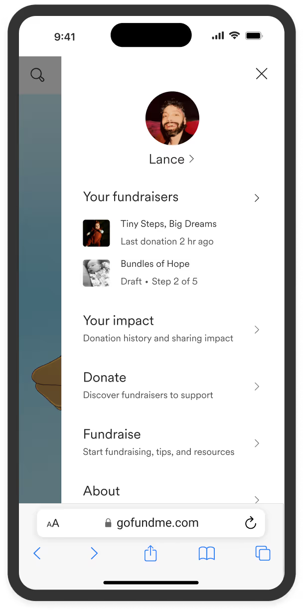
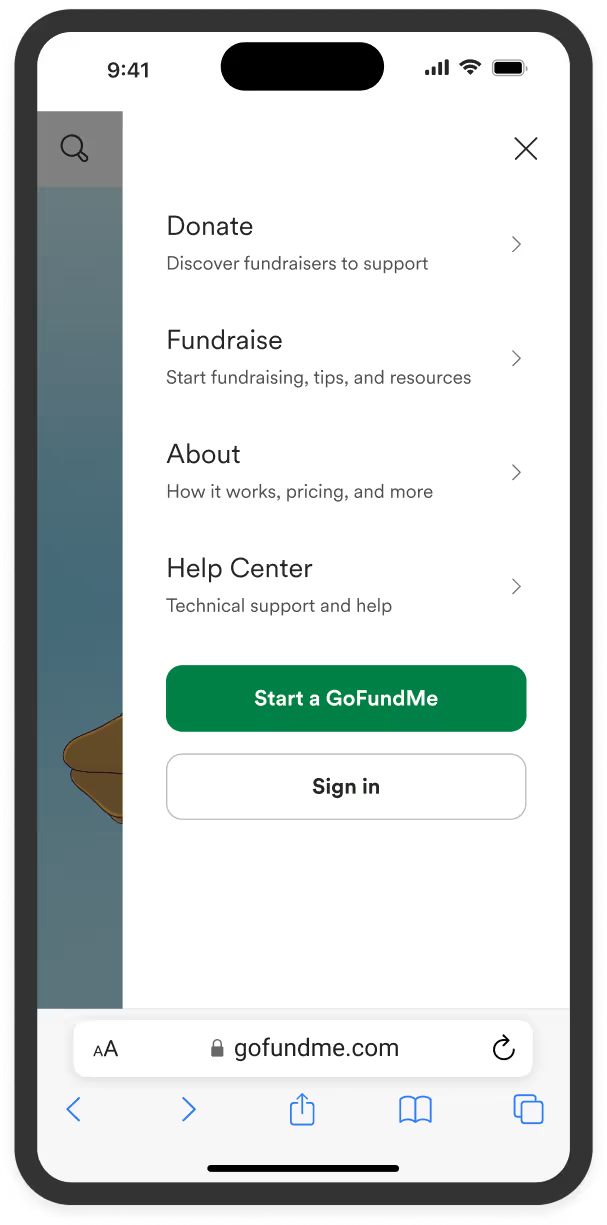
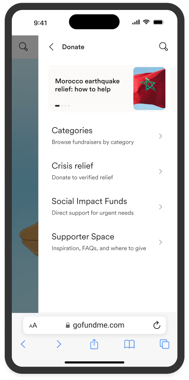
Fixing a messy navigation system
For years, different teams had their hands on navigation, leading to a patchwork of inconsistencies that left users scratching their heads. On top of that, we didn’t have proper tracking in place, so we had no clear picture of how the navigation was actually performing. My first step? A full audit to map out all the variations and work with teams to start collecting real data.
.avif)
Figuring out what users actually want
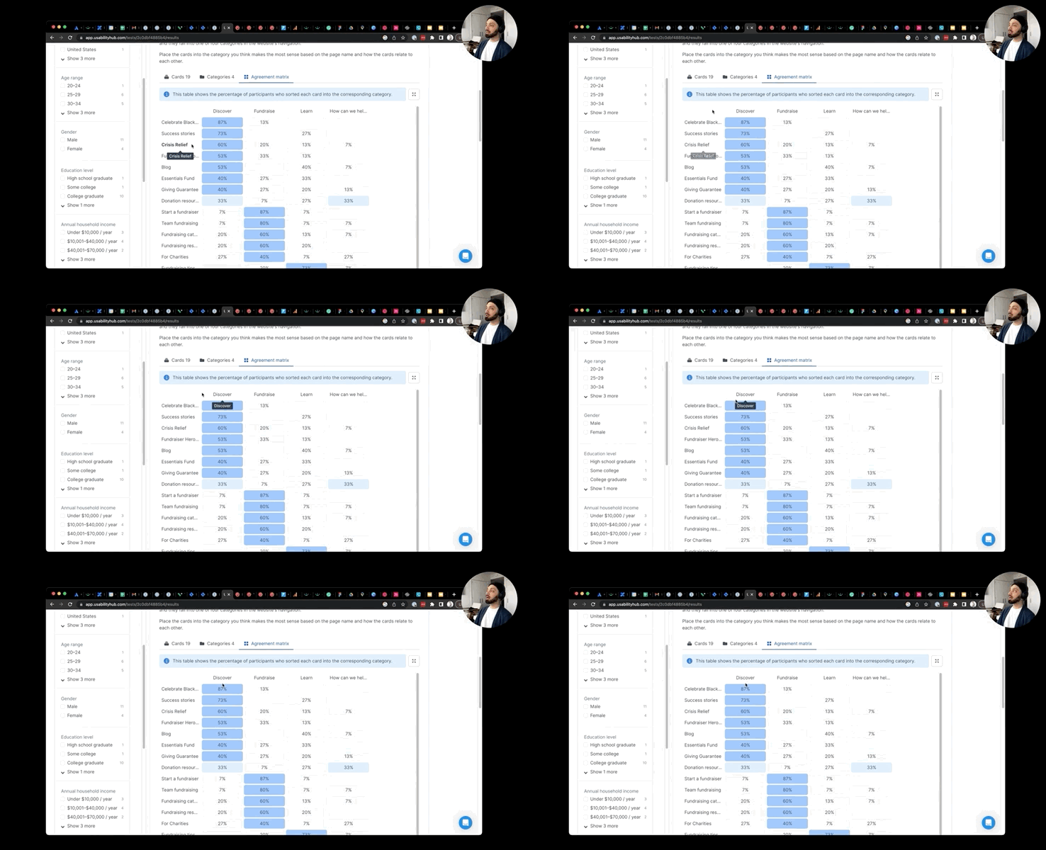
Since the main navigation structure hadn’t been rethought in years, we needed to understand how users perceived it before making any big changes. With our research team tied up, I rolled up my sleeves and ran some quick card-sorting exercises myself.
The results were eye-opening: our navigation was too vague. Users weren’t sure which sections were for donors versus fundraiser organizers, leading to a lot of guesswork. After a few rounds of iteration based on their feedback, we landed on a much clearer, more intuitive structure.
Testing out new navigation styles
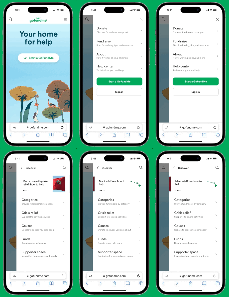
With a clearer framework in place, it was time to test how users actually interacted with the navigation. I put together prototypes for two different styles:
Accordion-style navigation (similar to what we already had).
Sequential drawer-style navigation
"The sequential menu starts by displaying the primary categories; once people select one of them, the list of primary categories is replaced by the subcategories of the selcted category. The popularity of sequential menus has increased significantly on mobile in the past few years, as they seem an easy solution to the problem of displaying many categories and subcategories on a small screen."
— Nielsen Norman Group
Users overwhelmingly preferred the sequential drawer—it just felt more intuitive. So that’s the direction we went with.
The impact
Once we rolled out tracking, we saw that navigation mattered more on some pages than others—especially the homepage, where engagement was high. So we tested the new design there first, then on fundraiser pages, before expanding site-wide.
The results? Not only did usability improve, but donations and shares saw a major lift, and fundraiser publishes trended up as well. Based on the reults of the homepage and fundraiser page tests, our estimated impact is in the millions per year. I then went on to support the international rollout of the navigation, working with teams on translations and cultural nuances.
Navigation should be an invisible helper—something that just works without users thinking about it. But our new design did more than just improve usability—it drove real impact.

